
APP的基础——组件
Basics
Row
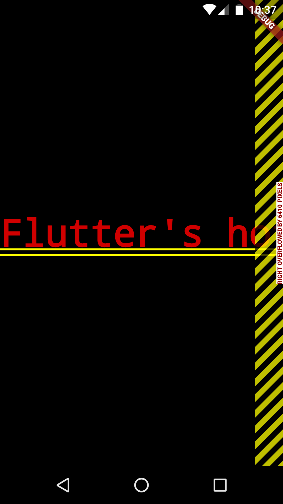
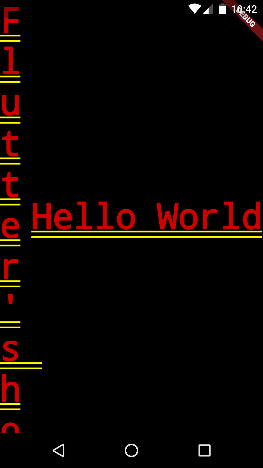
void main() {
  runApp(new MaterialApp(
    home: new RowDemo(),
  ));
}

class RowDemo extends StatelessWidget {
  @override
  Widget build(BuildContext context) {
    return new Row(
      children: <Widget>[
       const Text(
          'Flutter\'s hot reload helps you quickly and easily experiment, build UIs, add features, and fix bug faster. Experience sub-second reload times, without losing state, on emulators, simulators, and hardware for iOS and Android.',
          textAlign: TextAlign.start,
        ),
        const Text(
          'Hello World',
          textAlign: TextAlign.start,
        ),
      ],
    );
  }
}

布局算法
Column
Text
Image
Icon
Container
AppBar
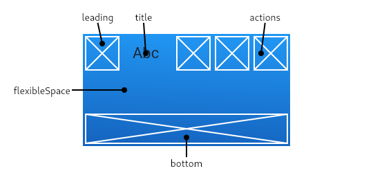
Scaffold
Text
Text
RichText
DefaultTextStyle
Input
Form
FormField
Material组件
App结构和导航
Buttons
Input和Selections
对话框
信息展示
Layout

Last updated